INSIDE THE PROJECT
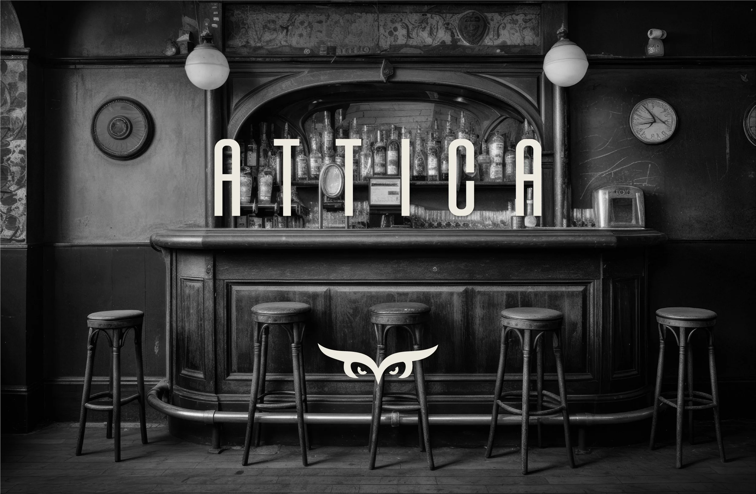
Attica — A rooftop club where sophistication, conversation, and nightlife come together.
Attica is a rooftop club that launched in February 2019 as a fresh and distinctive proposal within the local nightlife scene. Attica offers a carefully curated experience for those who appreciate good company, attention to detail etc.
▪ The starting point: From A to B
Attica is a rooftop club that launched in February 2019 as a fresh and distinctive proposal within the local nightlife scene.
Inspired by a sober and elegant Irish style, Attica offers a carefully curated experience for those who appreciate good company, attention to detail, and spaces that stand out without trying too hard.
We worked with the brand on the full development of its brand kit, ensuring visual, verbal, and strategic consistency across all touchpoints.
Alongside this, through an Express Mentoring programme, we focused on refining their digital business strategy, improving how the Attica experience is communicated and managed online. This was complemented by tailored Brand Add-Ons, designed to strengthen their presence and reinforce their positioning as a rooftop club with a clear identity and a well-defined offering.
▪ The Pandora’s Box: What we discovered
-
When we started working on the brand kit, everything was created from scratch: the name, the personality, the tone of voice and the visual universe. This allowed us to shape a brand with intention from day one, fully aligned with the experience Attica wanted to offer, without having to adapt or fix anything that already existed.
-
Throughout the brand development process, we understood how important it was to translate the rooftop concept into a clear and coherent brand. Every decision — from language to aesthetics — was carefully considered so Attica would have a solid and authentic foundation to grow from and communicate with confidence.
-
Once the brand kit was complete, we used the Express mentoring to build the digital business strategy from scratch. This helped bring clarity, set priorities and create a clear path to translate the Attica experience into the digital space in a way that feels consistent and true to the brand.
▪ The Challenge: A Strategic Move
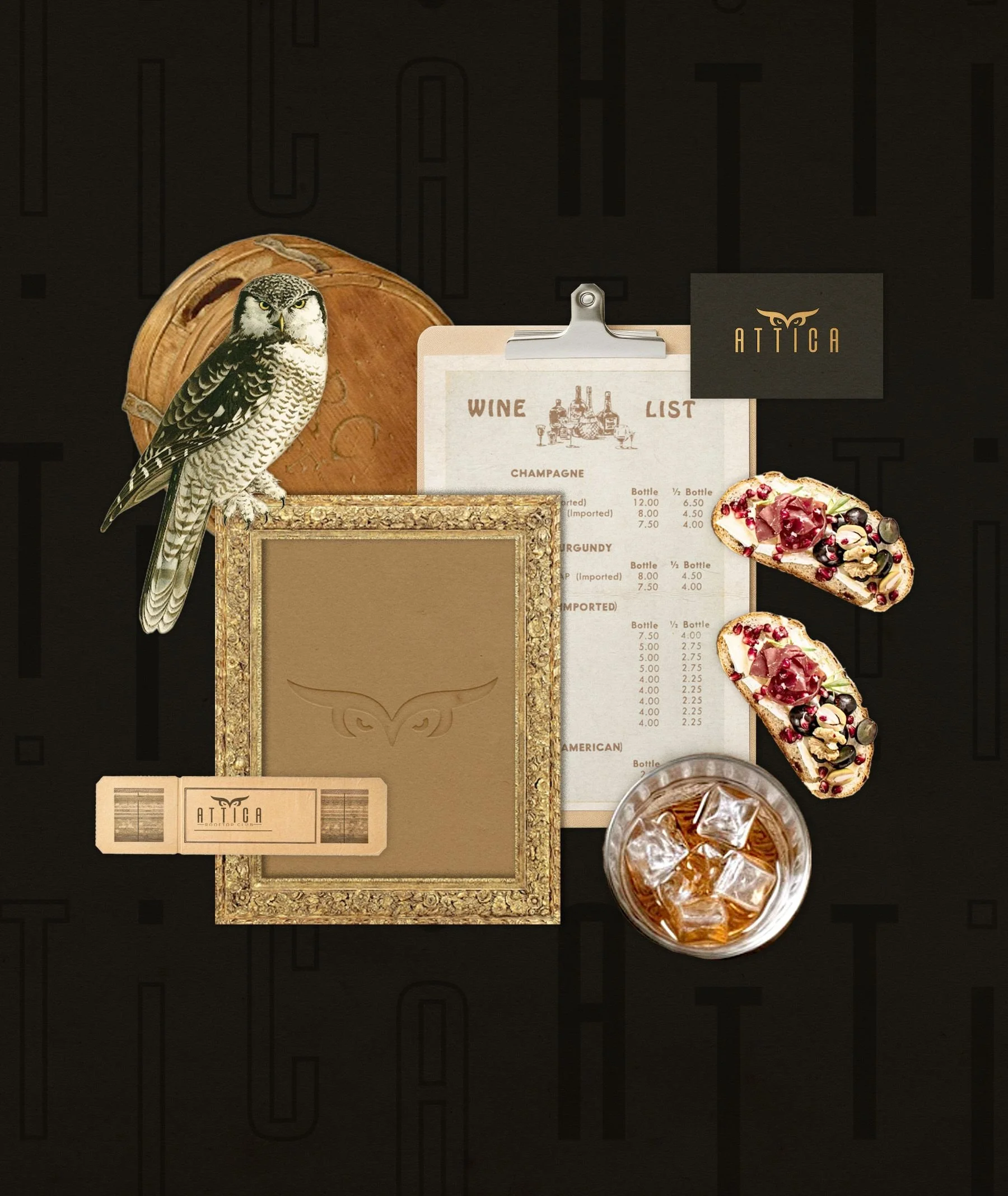
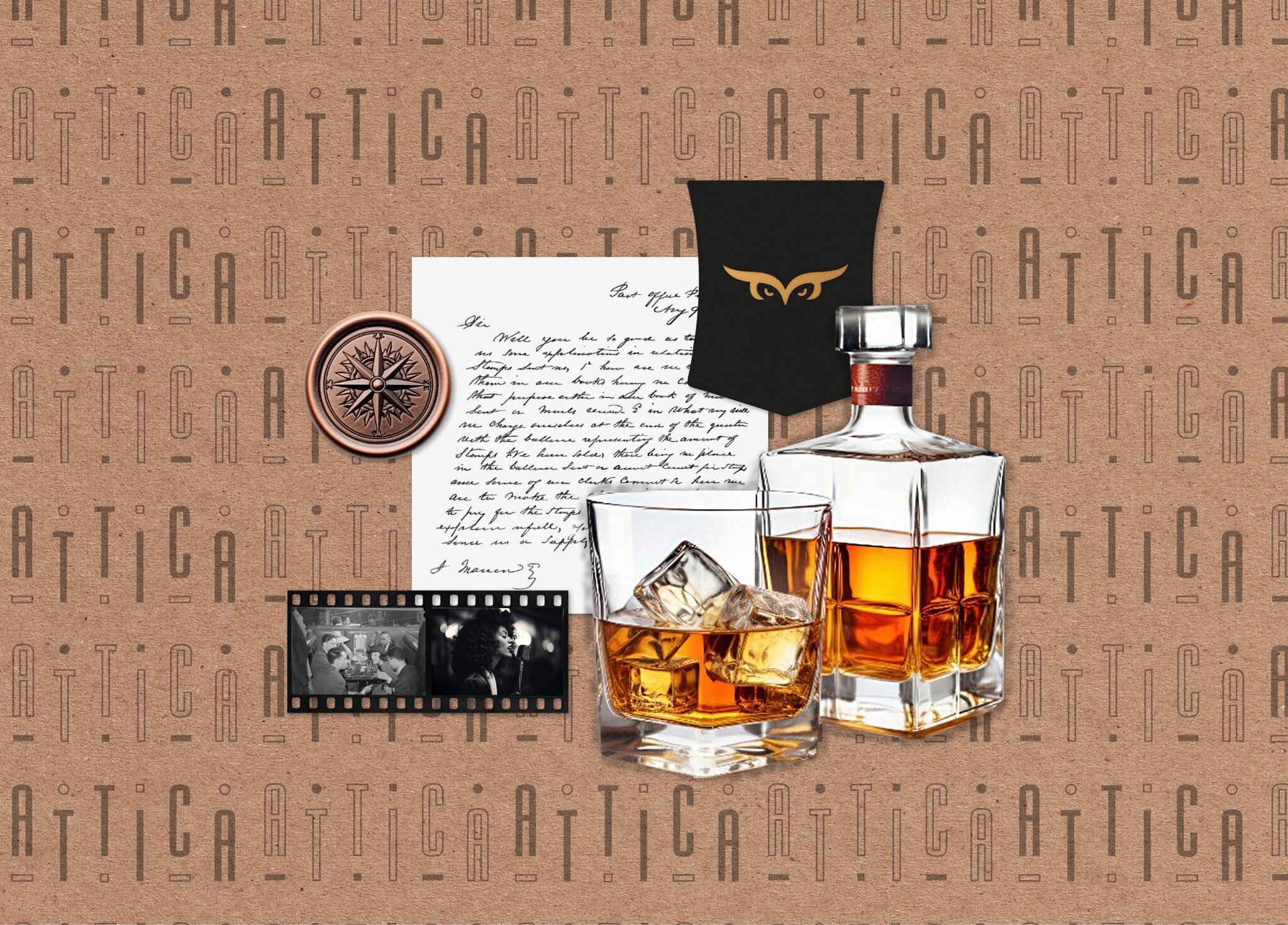
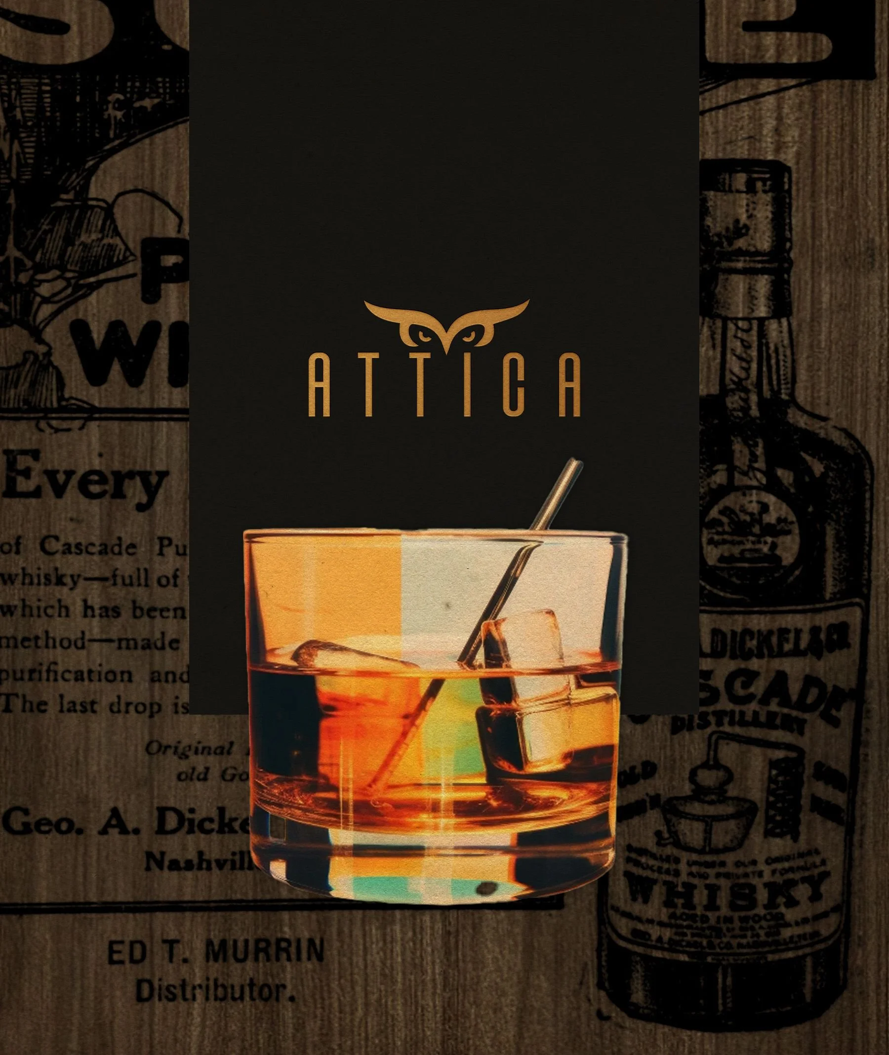
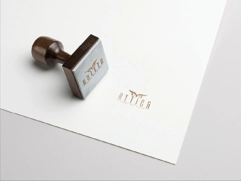
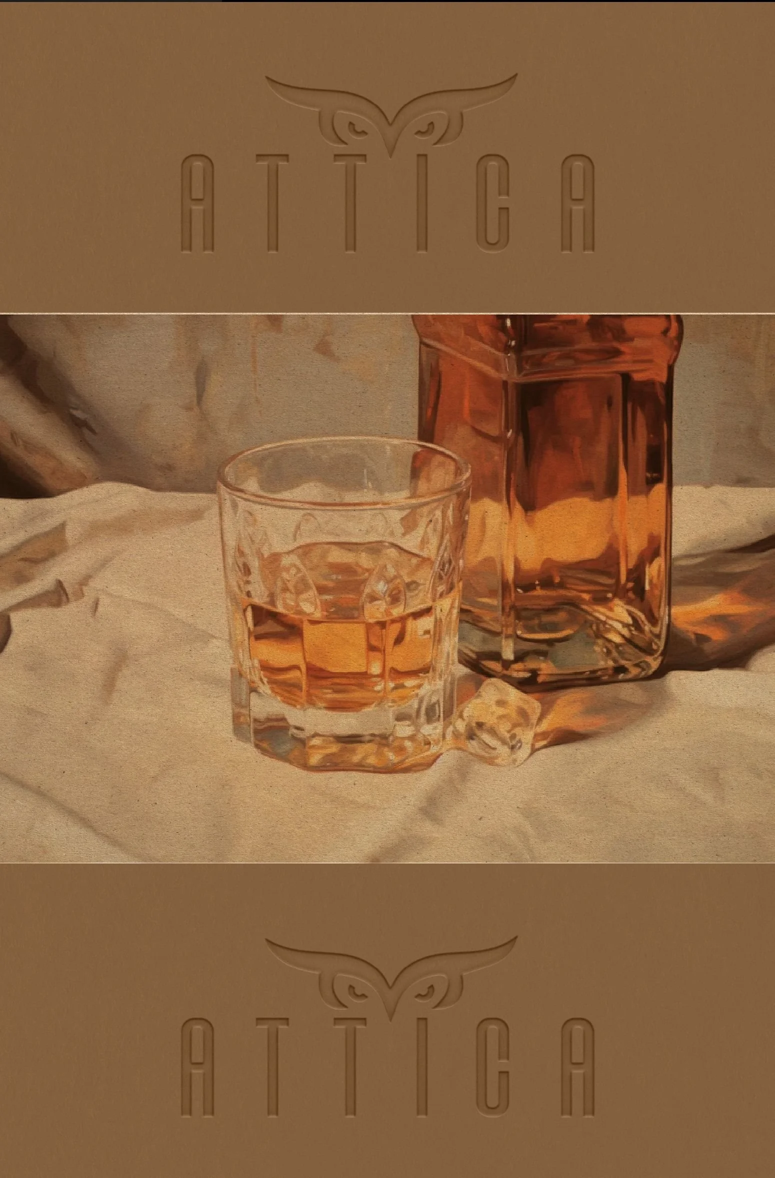
We began by identifying the starting point of the project: finding a name that truly matched the client’s vision and their request to include an owl as a key symbol of the brand. This led us to explore concepts linked to observation, intelligence and quiet authority, where the name needed to feel timeless rather than trendy. From this process, Attica was born, derived from the Greek “Attikós”, subtly connected to ideas of intellect, sophistication and cultural depth. The name became the foundation for the creative concept Old Money Irish Rooftop Experience, shaping a brand that feels refined without being distant. Every decision followed this direction, creating a space that values atmosphere, meaningful conversations and understated elegance, where visitors are invited to stay longer, enjoy the moment and connect naturally with the experience.
SOPHISTICATION
EXCLUSIVITY
DISTINCTION
SOPHISTICATION EXCLUSIVITY DISTINCTION
▪ Change in Action: Beyond What Meets the Eye

BRAND ARCHETYPE:THE RULER
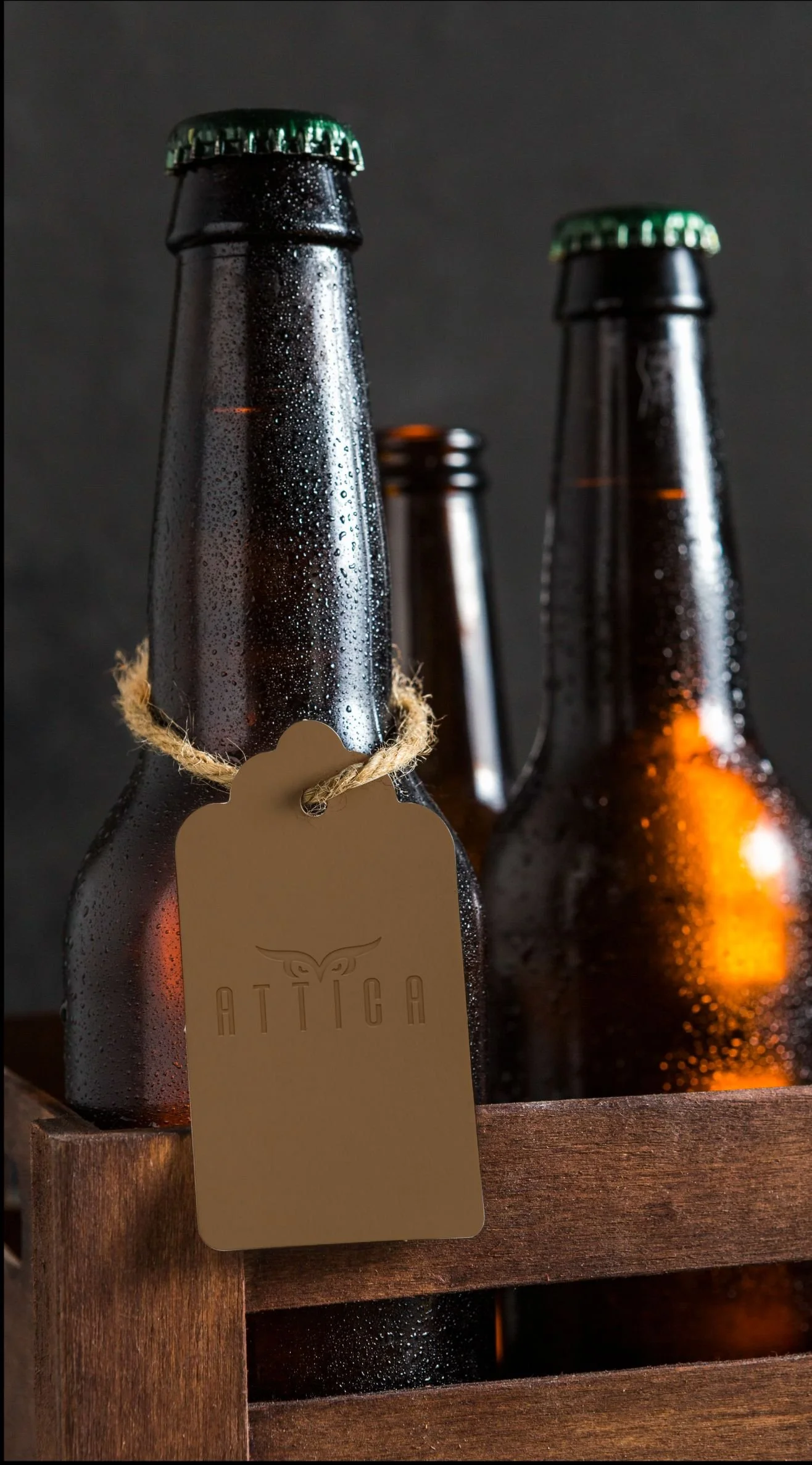
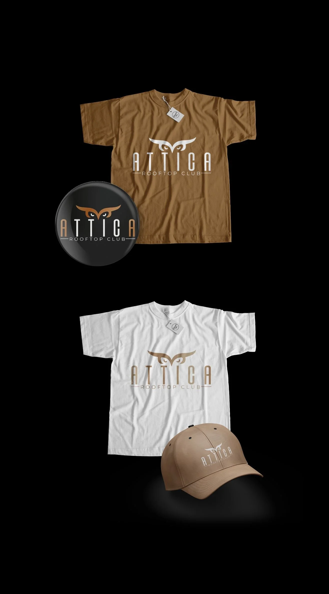
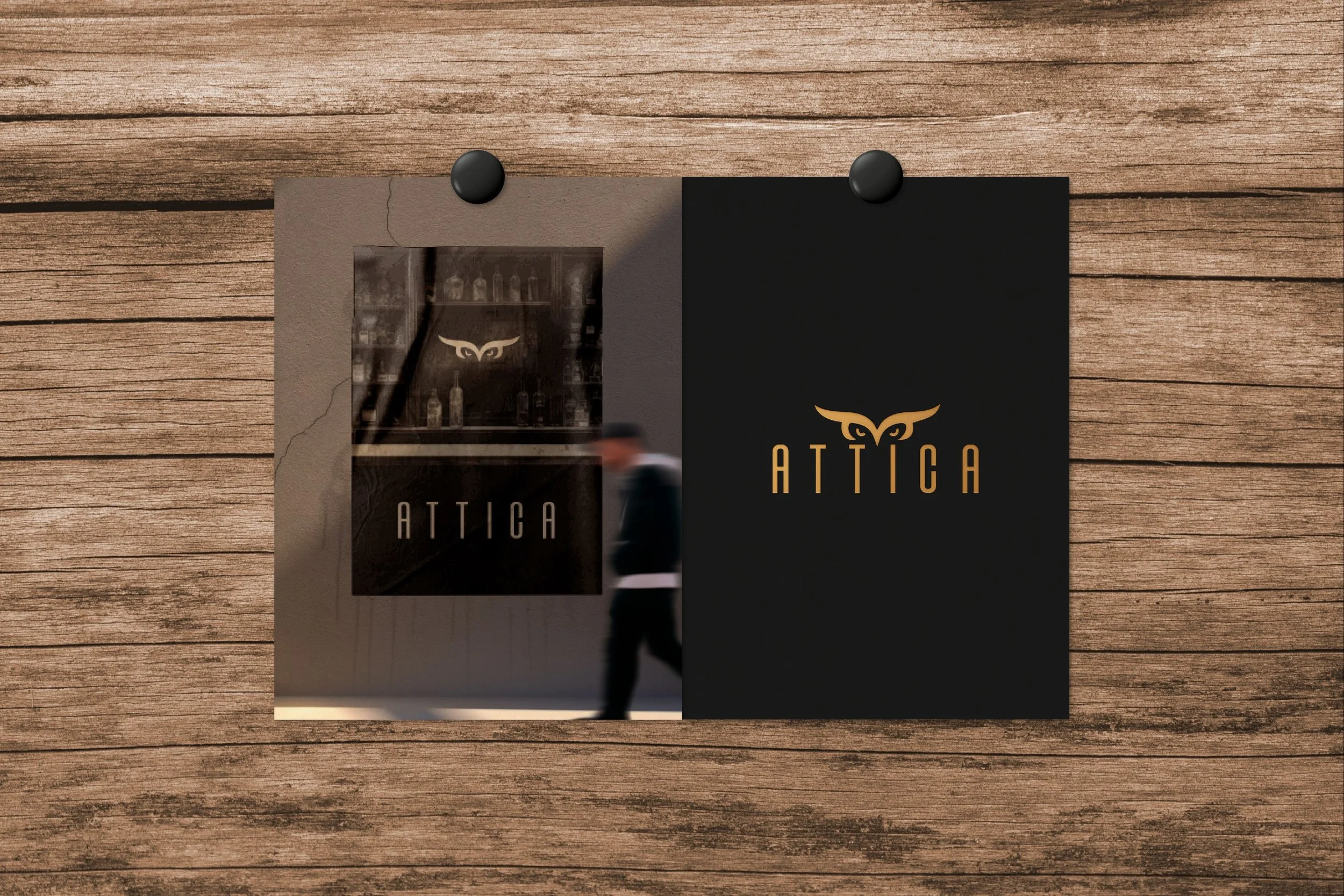
The strategic work behind Attica is not immediately visible, but it supports every brand decision. From scratch, a complete Brand Kit was developed, starting with a clearly defined visual identity built around three main colours and a structured typographic system to ensure consistency across all touchpoints. On the verbal side, taglines such as “Where conversations linger” and “Stay longer, talk deeper” were crafted, alongside a sober, approachable and elegant tone of voice. From a sensory perspective, visual cues and language rhythm were aligned to convey calm and sophistication, while the conceptual direction for the venue’s signature scent was outlined and remains in development as part of the immersive rooftop experience. All of this work was integrated into a solid brand strategy, allowing the identity to be applied consistently across both physical and digital spaces, strengthening recognition, coherence, and presence.
▪ Results: What we achieve together
The work carried out with Attica laid solid foundations for the business’s growth, aligning strategy, identity, and decision-making. Through a clear and structured approach, measurable progress was achieved both at a strategic level and in brand development, allowing for coherent and sustainable implementation.
-
After the express mentoring sessions, a clear digital presence structure and commercial priorities were defined. This helped reduce the time spent on operational decision-making related to communication and sales by approximately 40%, enabling faster and more focused execution.
-
With the creation of the brand kit, Attica successfully unified its visual and verbal communication across all touchpoints, achieving 30% brand consistency on social media, digital materials and internal communication, removing scattered messages and styles.
-
Thanks to a clear identity and the definition of taglines and tone of voice, the brand achieved an estimated 30% improvement in spontaneous brand recognition, reflected in direct customer interactions where people describe the Attica experience with greater clarity and consistency.
▪ Classified file: Additional data
INDUSTRY: Gastronomic and social experiences
LOCATION: Westport, Ireland
START OF BUSINESS OPERATIONS: 2019
PROJECT COMPLETION: January 2019
▪ Behind the scenes: Team credit
GRAPHIC DESIGNER: María José Alcívar
COPYWRITER: Sandra Voltinaer
ANIMATIONS: Héctor Terreros
CREATIVE & STRATEGIC DIRECTION: María Fernanda Ayala


A kind note from the client
“From a good idea to a business with direction”
When we started Attica, we had the idea in our heads, but if I’m honest, everything felt a bit messy. We knew the vibe we wanted, but we didn’t really know how to put it all together in a clear way.
The process helped us slow down and actually think things through. We stopped guessing and started making decisions that made sense. Step by step, Attica began to feel more solid and more intentional, not just something we were figuring out as we went.
What I liked most was how practical it was. No complicated talk, no overthinking. Just clear conversations and real actions. Now, when people come to Attica, what they feel matches what we had in mind from the start.
It finally feels like we’re building something with direction, not just running a place day by day.
— SEÁN WALSH- ATTICA (IRELAND)