INSIDE THE PROJECT
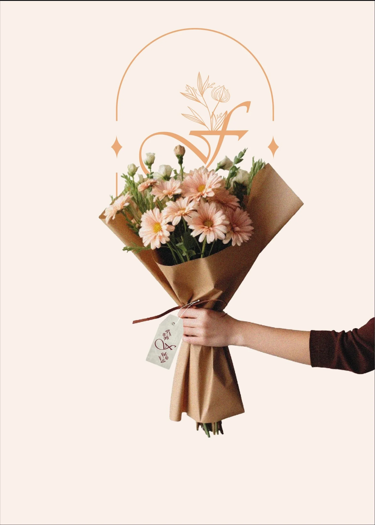
Fresia — Flowers that connect origin, emotion, and everyday beauty.
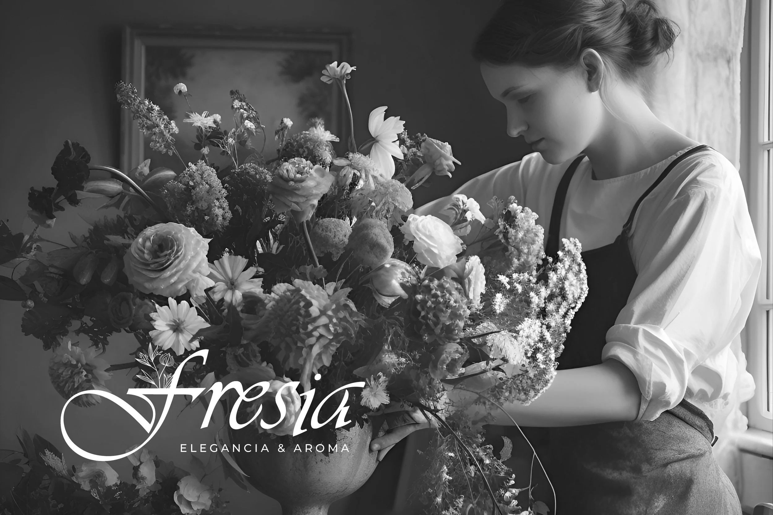
Fresia Soche Pullki is a floral brand launched in May 2025, created by Fresia, a young French woman with Ecuadorian roots who decided to begin her floral journey from France.
▪ The starting point: From A to B
Fresia Soche Pullki is a floral brand launched in May 2025, created by Fresia, a young French woman with Ecuadorian roots who decided to begin her floral journey from France. The brand naturally connects two worlds deeply linked by flowers: the land where they are grown and the place where they are lived and enjoyed.
In a country where over 80% of the flowers come from Ecuador, Fresia Soche Pullki was born as a bridge between origin and destination, between heritage and present-day expression. From the very beginning, Fresia chose to build her project on strong foundations.
That’s why we worked together on the Brand Kit and Meraki Mentoring, shaping not only a clear visual and verbal identity, but also a solid direction for the business.
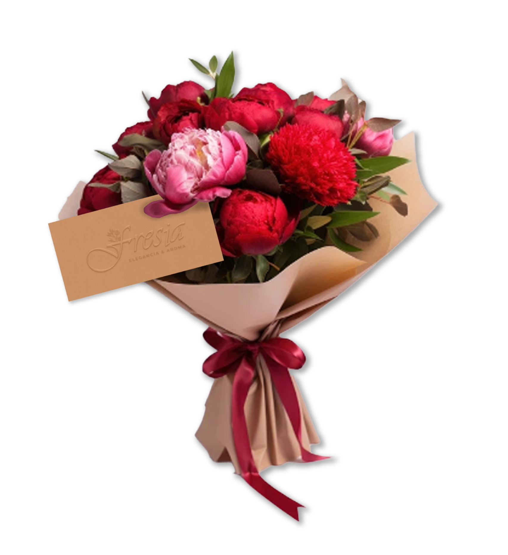
Fresia Soche Pullki isn’t about flowers for specific occasions. It’s about creating arrangements with intention — pieces designed to be part of everyday life, thoughtful gestures, and those quiet moments that deserve to be marked with beauty, care, and respect for the craft.
▪ The Pandora’s Box: What we discovered at the start
-
From our very first conversations, it became clear that Fresia has a deep connexion with flowers and their origin, especially the value of Ecuadorian flowers within the French market. There was a genuine intention to create something more than just a flower shop: a project built on meaning, care and respect for the craft.
-
At the beginning, we saw that the project had a well-defined essence, but it didn’t yet have a visual, verbal or sensory language to express it clearly. The brand was at a very early stage, full of potential, but still waiting to be translated into a clear and recognisable identity.
-
We also identified that the project was at the perfect moment to make thoughtful, intentional decisions. With no existing structures, messaging or processes in place, there was complete freedom to define the direction of the business from its very first steps, with clarity and a long-term vision.
▪ The Challenge: Mapping the master move
The starting point was to structure the business model, understanding how the flower shop should operate, who it should speak to, and how it could stand out in the French market without relying on the traditional events or wedding focus. We looked closely at the cultural context, buying habits, and the perceived value of Ecuadorian flowers in France, shaping a proposal that felt realistic and aligned with the brand’s lifestyle and vision. Once this foundation was clear, we developed the brand strategy, defining its purpose, positioning, and narrative, making sure everything felt coherent and intentional. From there, we set the key parameters that would bring order to the project — visual identity, verbal language, and the sensory dimension — ensuring every decision followed a clear logic. This process marked the beginning of a brand built on solid foundations, ready to grow organically, sustainably, and with an identity capable of connecting both locally and internationally.
FLORAL EXPRESSION
NATURAL AESTHETICS
CARE
FLORAL EXPRESSION NATURAL AESTHETICS CARE
▪ Change in Action: Beyond What Meets the Eye

BRAND ARCHETYPE:THE LIBERATOR
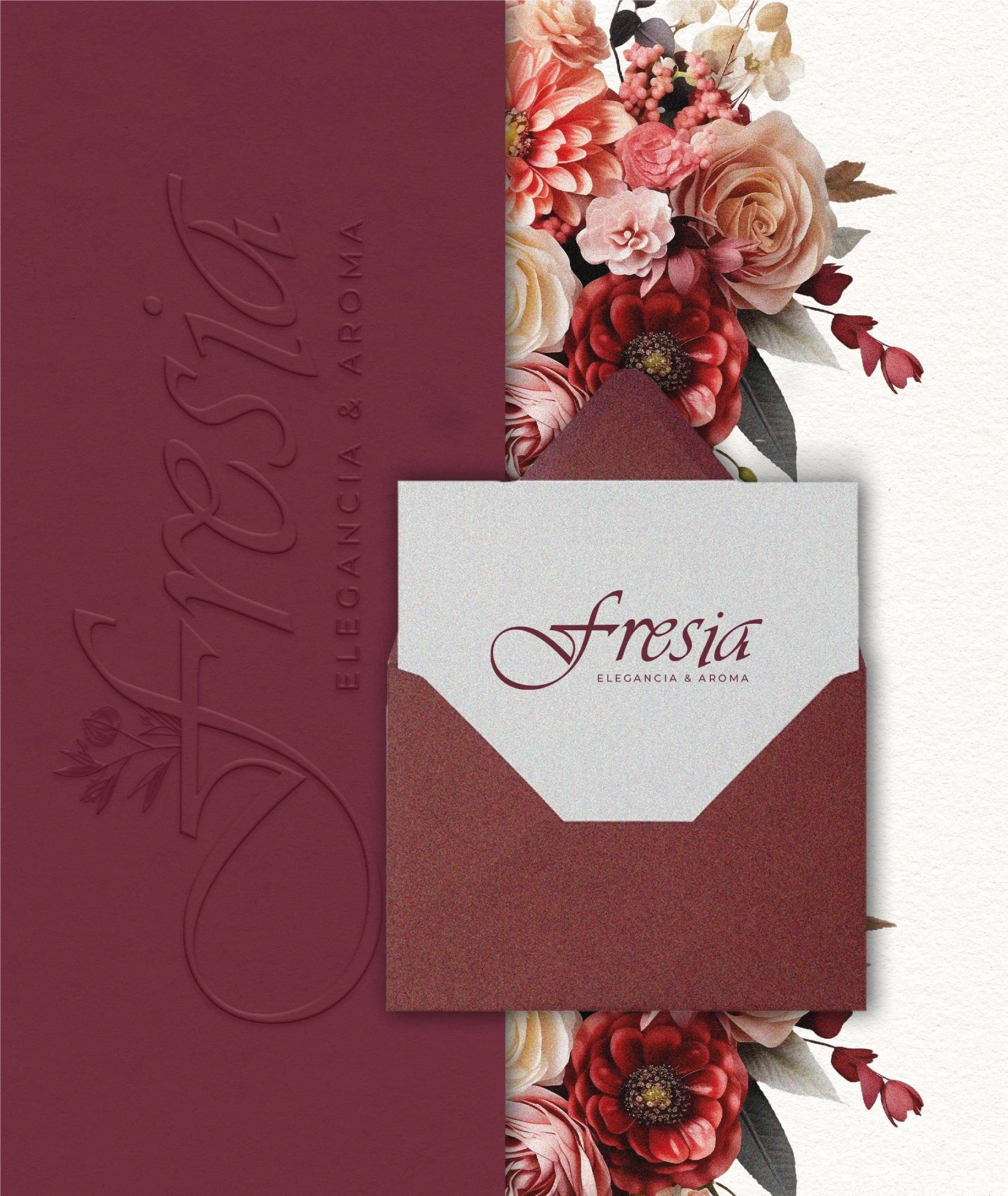
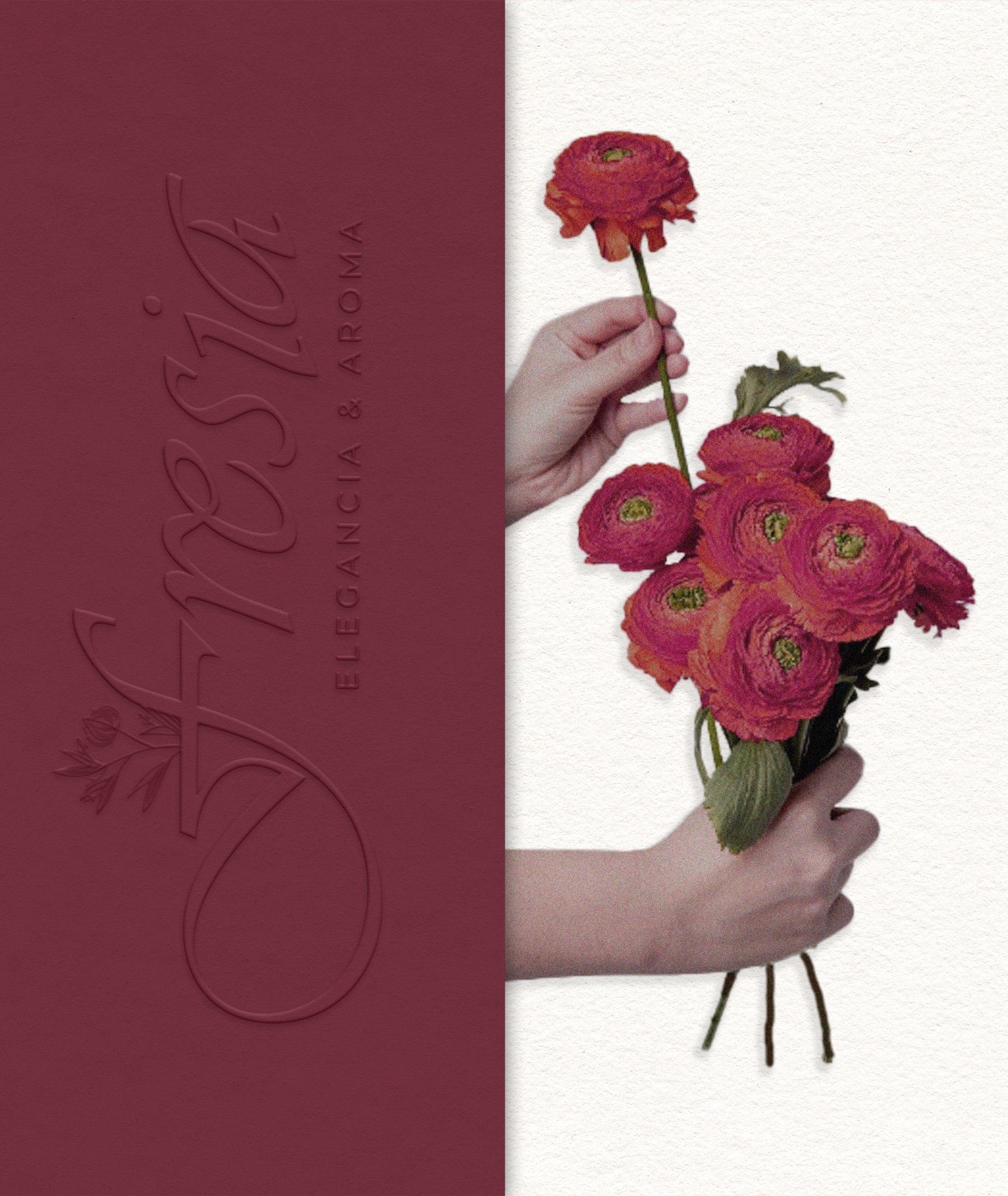
In the Fresia Brand Kit, we worked from a clear strategic base: building a brand capable of conveying sensitivity, origin, and consistency at every touchpoint. The brand strategy was defined to position the business outside the traditional events circuit, focusing instead on the emotional value of flowers in everyday life and the cultural connexion between France and Ecuador.
The verbal identity was shaped around a warm, poetic, and honest tone, using messages that speak of origin, care, and a slower rhythm, avoiding aggressive sales language.
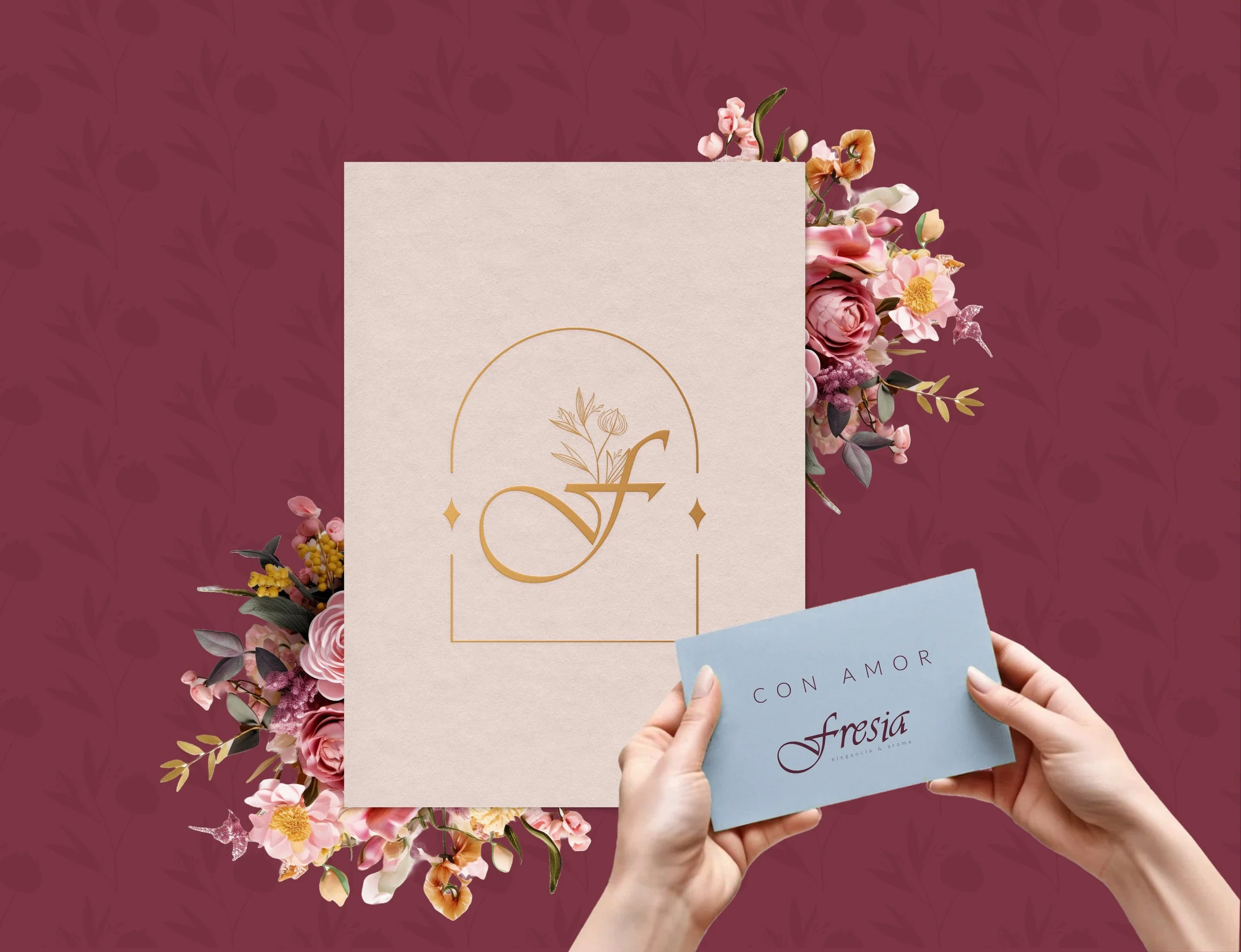
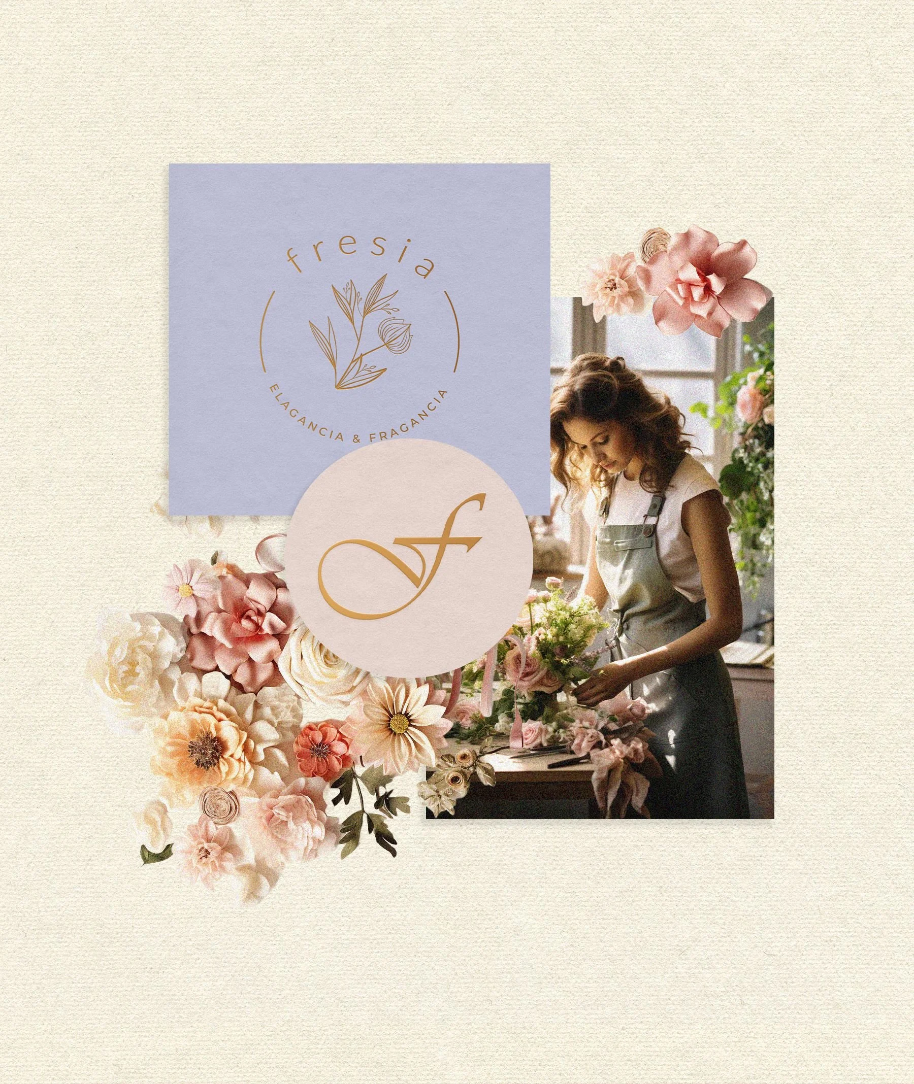
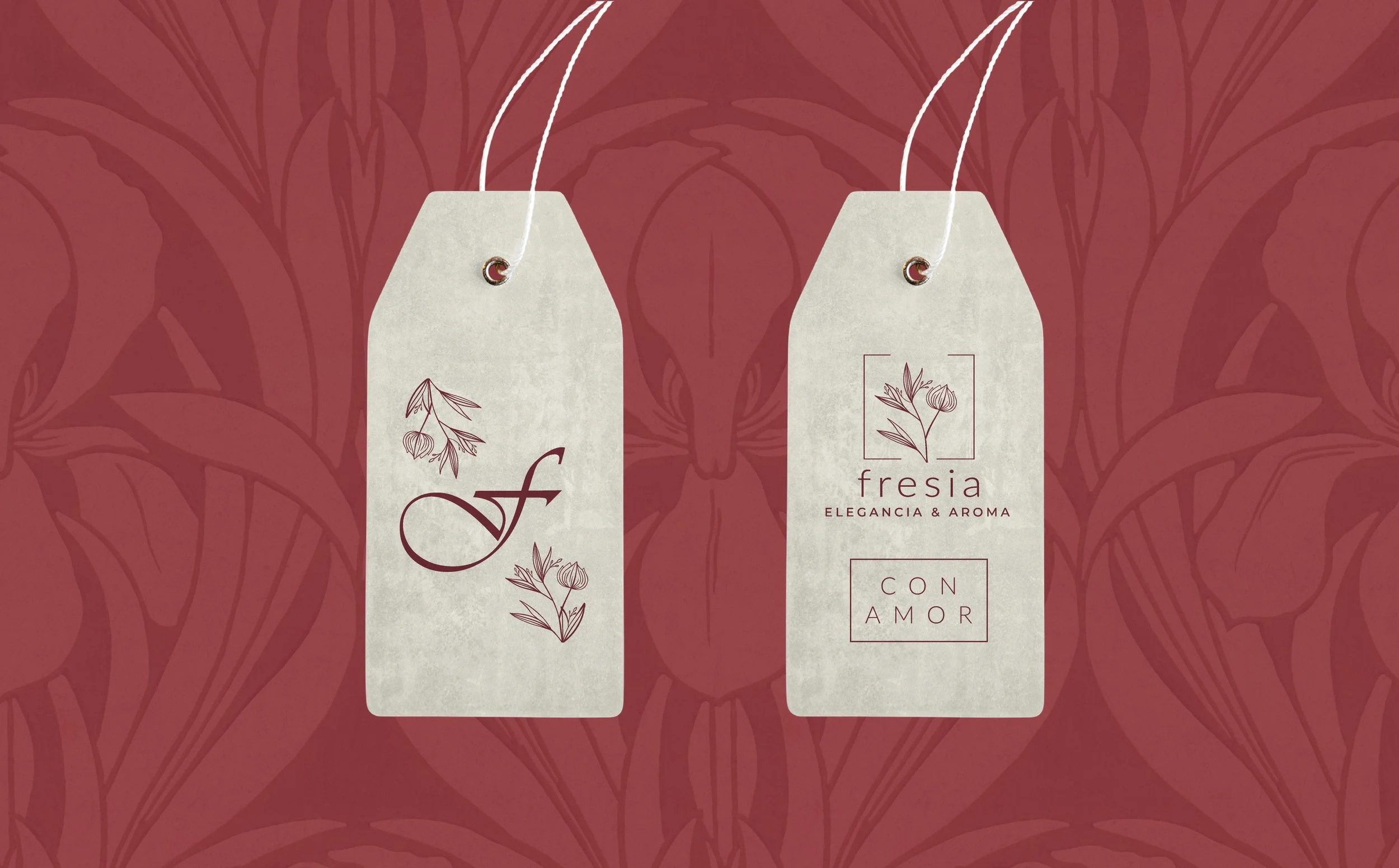
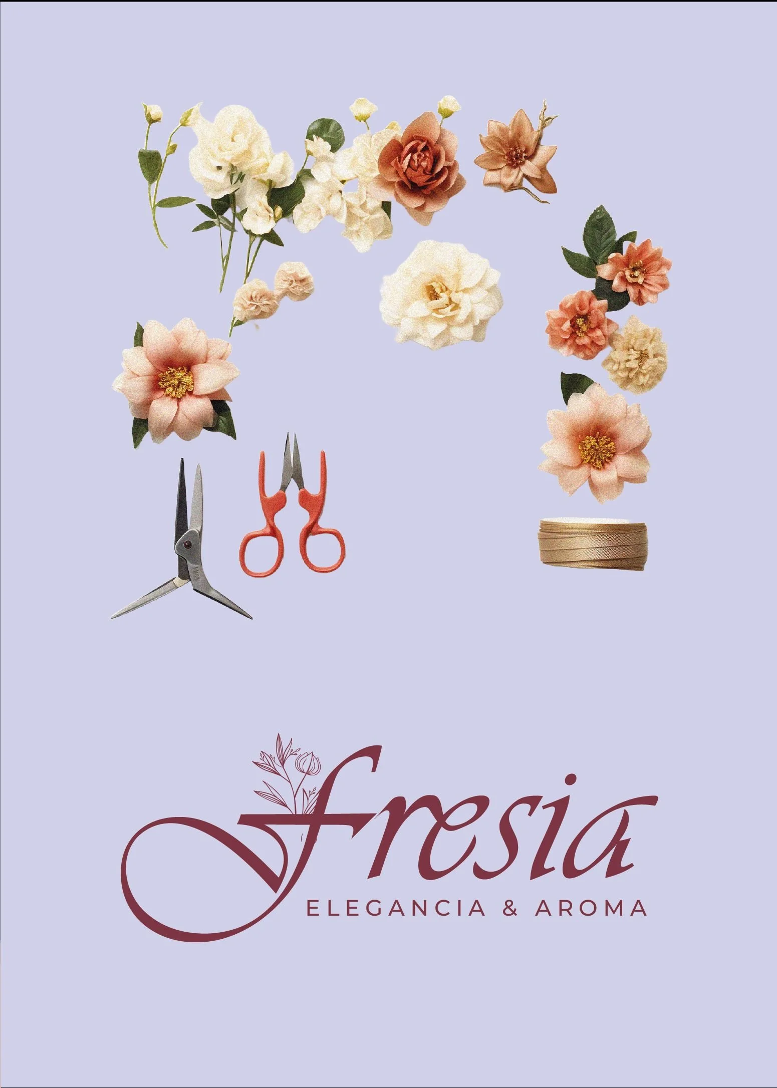
On a sensory level, we defined brand cues linked to the overall experience, such as the use of natural textures, organic materials, and a visual narrative that evokes freshness and calm. The visual system was designed to be flexible and easy to apply across both digital and physical pieces, ensuring consistency and recognition. The entire kit was created to support the project’s growth, allowing every brand action to feel intentional, human, and true to its essence.
▪ Results: What we achieve together
The launch of Fresia was built on strong foundations, combining a clear business structure with a well-defined brand from day one. Rather than relying on assumptions, the project focused on making informed decisions that allowed the brand to grow with intention, coherence, and real market validation.
-
Through the Meraki mentoring process, Fresia defined a solid business model before launching. This made it possible to clearly organise pricing, product categories and operational priorities, reducing decision-making time by around 25% during the first months and allowing her to focus on execution rather than constant adjustments.
-
The complete brand kit gave the project a consistent visual, verbal and sensorial identity, making the brand instantly recognisable across all touchpoints. As a result, customer enquiries became more aligned with the brand’s positioning, and repeat purchases increased by approximately 20% within the first quarter after launch.
-
Thanks to a well-defined value proposition and a brand built with intention from the outset, Fresia Soche Pullki received a very positive market response. During the three months following its launch, the brand achieved consistent sold-out results across its initial collections, confirming both product demand and strong alignment with its target audience.

▪ Classified file: Additional data
INDUSTRY: Floriculture & Botanical Design
LOCATION: Poitiers, France
START OF BUSINESS OPERATIONS: 2025
PROJECT COMPLETION: March 2025
▪ Behind the scenes: Team credit
BRAND DESIGN: Creative House by María Fernanda Ayala
COPYWRITER: Sandra Voltinaer
ANIMATIONS: Laura Melo
CREATIVE & STRATEGIC DIRECTION: María Fernanda Ayala


A kind note from the client
“Creating a brand from the heart”
Before starting the brand, I was incredibly excited, but also full of doubts. I knew I wanted to work with flowers and that this project really mattered to me, but I didn’t quite know where to begin or how to organise everything without feeling overwhelmed. I had a beautiful idea, but I needed clarity and direction.
During the process, something that was very important to me was deciding that the brand would speak in Spanish. Even though I live in France, it felt like a meaningful way to honour my roots and my parents, who are Ecuadorian. Choosing the brand’s name and slogan in Spanish made me feel much more connected to the story I wanted to tell.
Working together helped me stay grounded without losing the essence of the project. I started to understand how to structure the business, make decisions with more confidence, and trust that what I was creating truly made sense. The whole process felt close and very human; I never felt rushed, only supported at every step.
Today, the brand feels aligned with who I am. I know how to present my arrangements, how to communicate with my customers, and how to organise my work without chaos. Seeing my collections sell out in the first few months was a clear sign that I was on the right path. Now I work with more calm, more clarity, and the reassurance that this project has solid foundations to grow.
— FRESIA SOCHE PULLKI- FRESIA (FRANCE)